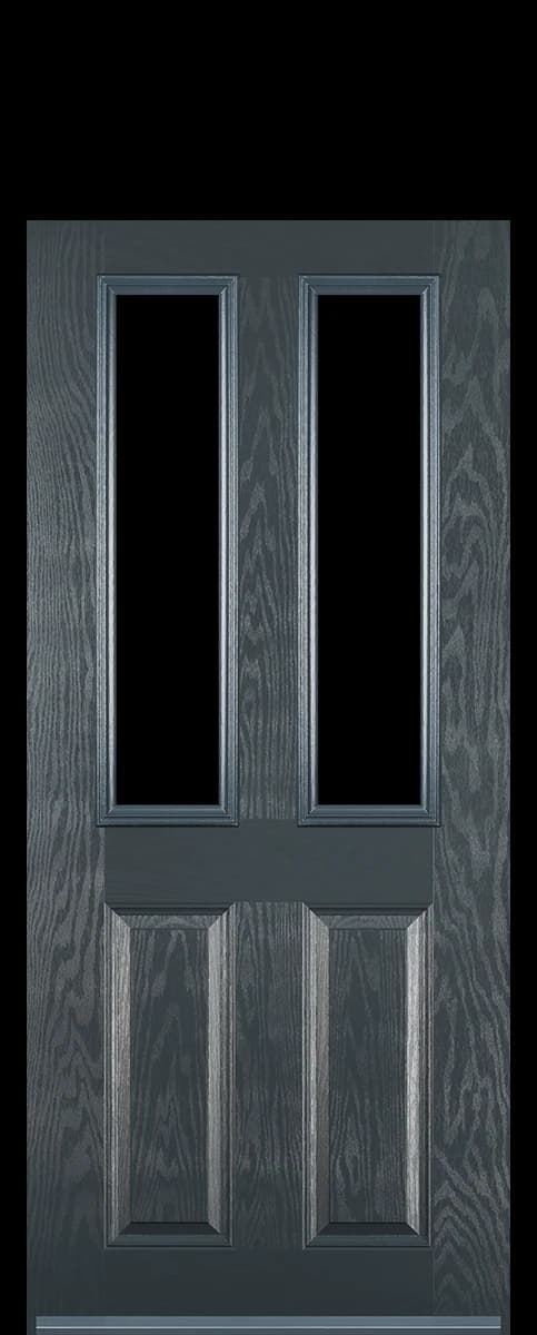


Colour is the decision people change their mind about most, and the one a screen is worst at helping with. A door is a large flat object seen in daylight against brick, and none of that survives being shrunk to a swatch on a phone.
Every colour costs the same
This surprises people, because most of the trade charges more for anything that is not white. It does not here. Choose on how it looks against the house rather than on what it adds to the bill, because it adds nothing.
The frame is priced separately, and a woodgrain frame does cost more than a white one. That is the only colour decision on this page that moves the price.
What tends to work
Against red brick, the darker greens and blues sit well because they are cool against a warm wall. Chartwell Green sells more than anything else on nineteen-thirties and post-war houses for exactly that reason.
Against buff or yellow brick and against stone, the safer ground is quieter: cream, a soft grey, an off-white. A strong colour on pale stone tends to shout, and cottages in particular look better when the door is not the loudest thing on the frontage.
Anthracite and Agate Grey suit anything built or reordered in the last thirty years, and they are the usual answer on a house with white uPVC windows because grey and white do not argue.
- Agate Grey
- Grey
- Black
- Black Brown
- Blue
- Chartwell Green
- Cream
- Dark WoodWoodgrain
- Duck Egg Blue
- Fern Green
- Green
- OakWoodgrain
- Pastel Blue
- Pebble Grey
- Poppy Red (High Gloss)
- Purple Violet
- Red
- Turquoise Blue
- White
Two things a screen will not tell you
Very pale colours flatten the mouldings. On a panelled door the shadow lines are what make it read as panels at all, and cream or white in flat overcast light can lose most of that. A mid tone holds the detail better.
Dark colours on a south-facing door get hot. That is normal for a composite and it is not a fault, but it is worth knowing before you put black on a door that catches full afternoon sun.
Judging it from a screen
We do not send samples, so be honest with yourself about what a screen can and cannot tell you. The renders here are the manufacturer's own photographs of each colour, which is as close as a screen gets, and every monitor and phone still shows them slightly differently.
The visualiser helps more than a swatch would for the thing people actually get wrong, which is not the shade itself but how it sits against their own brick in their own light. Put your house through it before you decide, and look at the result on more than one screen.
If you are between two colours and cannot separate them, say so when you send the specification. Somebody who sees these doors go up every week will tell you which one works on a house like yours.
Still unsure? Send a photograph of the opening with your question.
Ask us